Speak Data: A Language Learner’s Guide to Describing Charts and Graphs
Contents
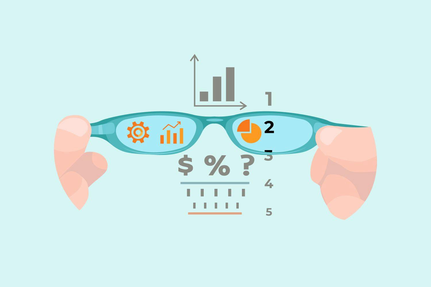
Data visualization has become a crucial aspect of how we communicate information. Whether it’s sales figures, population data, or scientific findings – charts and graphs help to quickly convey meaningful insights that can inform decisions across various fields. Describing charts can be challenging for language learners, as it requires both knowledge of the terminology and understanding how to effectively identify trends and patterns. Keep reading this guide and learn how to describe a graph like a pro.
Know Your Chart Types: A Quick Tour
Before diving into describing graphs, it’s helpful to know the different types of visual aids you may encounter. Here are some common ones:
- Bar charts. These charts represent data with rectangular bars, making them ideal for comparing values between categories.
- Line graphs. They show changes in data over time and help identify trends or patterns that may occur within a particular period.
- Histograms. These are similar to bar graphs but explicitly used for displaying frequency distributions of continuous variables, such as age or time intervals.
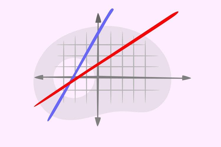
- Scatter plots. Such charts show relationships between two variables and help to identify correlations or patterns.
- Pie charts. They illustrate proportions and percentages, making them popular for presenting data as fractions or parts of the whole.
As you encounter different chart types, be sure to pay attention to the nuances of each and how they can be used effectively in various contexts.
Key Terminology: Charts and Graphs Vocabulary
Having the appropriate vocabulary is essential. From terms that represent elements of the diagram of a graph to expressions that convey trends and patterns, these words can help you create a clear and concise description. Below, we will provide some useful vocabulary related to graphs for language learners.
Elements of Charts and Graphs
To know how to write graphs, you must first identify different elements. Here are some key terminology words that can help:
- Axis [ˈæksɪs] – refers to the horizontal (x-axis) or vertical (y-axis) lines on a chart or graph that help indicate the scale and context of the data being displayed.
- Data point [ˈdeɪtə poɪnt] – an individual piece of information plotted on a chart or graph, representing a specific value for a given variable.
- Legend [ˈlɛdʒənd] – a chart component that explains what various colors or symbols used to represent different data points mean. It helps readers understand how to interpret a graph easily.
- Label [ˈleɪbəl] – a word or phrase that identifies a specific element of a chart or graph, such as the x-axis, y-axis, or data series.
- Scale [skeɪl] – the range of values represented on an axis, indicating the minimum and maximum values in a given dataset.
- Gridlines [ˈɡrɪdlaɪnz] – horizontal and vertical lines that divide a chart or graph into smaller sections to make it easier to read and interpret the data.
- Interval [ˈɪntərvəl] – the space or distance between markers on a scale or axis, often representing regular units or increments.
- Caption [ˈkæpʃən] – an explanation or description written beneath an image illustrating information about it.
- Trendline [ˈtrɛndlaɪn] – a line that indicates the general direction or trend, often drawn by connecting data points or using statistical methods to find the best fit.
- Title [ˈtaɪtəl] – a brief, descriptive heading at the top of a chart or graph that provides an overview of the data and helps readers understand the main idea of the visual representation.
These terms are foundational in describing a chart or graph and clarifying the visual aid’s components.
Making Comparisons and Contrasts
Once you’ve identified vital terminology, it’s essential to describe the trends or patterns in the graph. Here are some expressions that can help you do just that:
- Increase [ɪnˈkriːs] – a rise or growth in the value of a data series over time.
- Decrease [dɪˈkriːs] – a decline or reduction in the value of a data series over time.
- Steady [ˈstɛdi] – describes a situation where the data points remain constant or relatively unchanged over time.
- Fluctuation [ˌflʌktʃuˈeɪʃn] – a variation or change in the value of a data series over time, usually involving alternating increases and decreases.
- Significant [sɪgˈnɪfɪkənt] – a notable or essential change or difference in the data.
- Slight [slaɪt] – a small or minor change or difference in the data.
- Peak [piːk] – the highest point or maximum value a data series reaches in a given period.
- Trough [trɒf] – the lowest point or minimum value.
- Plateau [plæˈtoʊ] – a period of little or no change in the data, during which the values remain relatively constant.
- Outlier [ˈaʊtˌlaɪər] – a data point that stands out from the rest because it is significantly different or deviates from the overall trend or pattern.
By mastering these terms and expressions, you can effectively describe how the data points in a chart or graph relate to one another.
Relationships and Trends
Charts and graphs can reveal valuable insights into how data points relate or change over time. Here are some key terminology words for describing relationships and trends:
- Correlation [ˌkɒrəˈleɪʃən] – a statistical measure of how two variables are related to each other, often indicated by a trendline on a scatter plot.
- Trend [trɛnd] – a general direction or pattern in which data points move upward, downward, or remain constant over time.
- Exponential [ˌɛksˌpəʊˈnɛnʃl] – a type of trend in which the rate of change in the data points increases or decreases rapidly over time.
- Linear [ˈlɪniər] – a trend in which the rate of change in the data points remains constant over time.
- Forecast [ˈfɔːkæst] – a prediction or projection of future values based on the current or historical trends in the data.
Using these words and expressions, you will know how to describe the trend of a graph. This can help to provide valuable insights for decision-making and planning.
Percentages, Fractions, and Numbers
Charts and graphs often involve numbers, percentages, and fractions that indicate specific values or proportions. Here are some key terminology words for these types of data:
- Percent [pərˈsɛnt] – a value expressed as a fraction of 100.
- Fraction [ˈfrækʃən] – a part of a whole expressed as a ratio of two numbers.
- Decimal [ˈdɛsɪməl] – a number expressed in the base-ten system, often used to represent fractions or parts of a whole.
- Integer [ˈɪntɪdʒər] – a whole number that is not a fraction or decimal.
- Average [ˈævərɪdʒ] – the arithmetic mean of a set of values, often represented as a single data point on a chart or graph.
- Range [reɪndʒ] – the difference between a dataset’s highest and lowest values.
- Minimum [ˈmɪnɪməm] – the lowest value in a dataset.
- Maximum [ˈmæksɪməm] – the highest value in a dataset.
- Median [ˈmiːdiən] – the middle value in a dataset when the values are arranged in order.
- Mode [moʊd] – the value that appears most frequently in a dataset.
With these words, you can effectively describe numerical data and provide insights into a dataset’s distribution, average, and range of values.
Time Frames and Intervals
When describing a line graph or any other type of chart that shows data over time, it’s crucial to use appropriate terms for the different time intervals. Here are some key terminology words related to timing:
- Time series [taɪm ˈsɪriːz] – a dataset that is recorded over some time.
- Interval [ˈɪntərvəl] – the period between data points in a time series.
- Duration [djʊˈreɪʃən] – the length of time covered by a time series.
- Frequency [ˈfriːkwənsi] – the number of occurrences of a particular event or value within a time.
- Annual [ˈænjuəl] – occurring or measured over a year.
- Quarterly [ˈkwɔrtərli] – happening every three months, often used in financial reporting.
These terms can describe the specific timing of data points in a chart or graph, providing additional context for readers and listeners.
Expressions for Describing Charts in English
While understanding the key terminology is essential, using appropriate expressions and phrases can elevate your description of charts and graphs:
- As we can see from the chart/graph...
- It’s worth noting that…
- According to the data presented in this graph, …
- The diagram of this bar chart shows us that…
- This pie chart clearly illustrates/provides information on/represents how…
- Taking a closer look at the line graph, one can observe...
- There was a significant increase/decrease/rise/fall/jump/drop/spike/plunge/sharp dive/slump/growth...
- During/outside/between 20xx – 20yy or From Month X until Month Y... etc.
- From the data presented, we can conclude that…
- The figures demonstrate/reveal/indicate/show/suggest that…
- It is interesting to note/highlight/emphasize…
By incorporating these expressions, you can give nuanced descriptions and insights into what’s happening in a chart or graph.
Putting It All Together: How to Describe Graphs Like a Pro
Now that you’ve learned about the different chart types, key terminology, and expressions, it’s time to assemble everything. Here are some tips for writing compelling descriptions:
- Start with the big picture. Before diving into the specifics, it’s essential to give an overview of what the chart or graph represents. This can include information about its type, purpose, and relevance. The more context you provide, the easier it will be for your audience to understand what they are looking at.
- Focus on critical trends and patterns. While every chart or graph has unique features, it’s essential to identify the most salient points being conveyed. This may include fluctuations in data over time, correlations between different variables, or comparisons across categories. Focus on the areas where you see significant changes happening so that people can understand what drives those differences.
- Use clear and concise language. In any chart description, it’s essential to use simple and direct expressions that are easy for your audience to understand. Try not to use jargon or technical terms if possible, as this can confuse people who may not be familiar with the terminology. It is best to use short sentences and break down complex ideas into smaller, manageable parts.
- Vary your sentence structures. To make your description more engaging and exciting, mix up the lengths of your sentences. Shorter, punchier statements help emphasize important points, while longer ones provide additional details or explanations. In addition, using different sentence structures like questions, metaphors, or comparisons can add depth and flavor to your descriptions.
- Practice. Like any new skill, mastering the art of describing graphs requires practice. Find charts or graph examples and challenge yourself to describe them using essential vocabulary, expressions, and clear language. Remember the different chart types and the most relevant elements as you continue practicing.
These tips will help you describe graphs and charts effectively. Remember, the goal is to identify patterns or trends and provide meaningful insights to inform decision-making across various fields of study.
7
Learn Graphs Vocabulary with Promova
If you’re a language learner looking to improve your skills in describing charts and graphs, Promova has everything you need! With word lists, quizzes, and interactive exercises, our language learning platform will help you to master new vocabulary, understand data, and communicate effectively in various contexts. Plus, our blog contains many informative articles, so you will find guides on describing a person in English or even how to talk about politics.
Those who want to master English fun and engagingly can take advantage of our one-on-one and group lessons with certified tutors. Our personalized approach allows us to tailor your learning experience according to your needs and preferences, so you can make the most out of every session without feeling stressed or overwhelmed.
And if you want to immerse yourself in a community of language learners and practice your speaking skills, our Conversation Club is the perfect place for you. You will meet people worldwide who share similar interests while receiving constructive feedback from certified tutors.
Conclusion
Now you know how to describe a line graph, bar chart, histogram, or pie chart. Remember to start by giving an overview of the purpose of the graph and then focus on key trends and patterns. With practice, you will improve at using clear and concise language and providing nuanced insights into the presented data. So don’t be intimidated – grab a chart or graph you want to describe, use our guide as a reference, and start practicing!
FAQ
How can I expand my vocabulary for describing charts and graphs?
Read articles, watch presentations with charts and graphs, and note new words and phrases. Also, try using dictionaries like Cambridge Dictionary or Merriam-Webster to find synonyms for common descriptive terms.
Are there any common mistakes to avoid when describing charts and graphs?
Some common mistakes include providing too much detail, using repetitive language, or focusing on insignificant data points. Instead, remember to concentrate on the key trends and patterns, use diverse vocabulary and sentence structures, and maintain a straightforward and engaging narrative.
How can I become more confident in describing charts and graphs?
Practice, practice, practice! Challenge yourself to describe different chart types using key vocabulary and expressions. Also, consider seeking feedback from others or a language tutor. The more you use these skills in real-life situations, the more comfortable you will be with effectively describing charts and graphs.
Which sources can help me improve my skills in describing charts and graphs?
You can use many sources to improve your skills in describing charts and graphs. For example, you can start by reading articles or watching videos that include visual aids like charts and graphs, then try describing them using the key vocabulary and expressions outlined in this guide. Also, the Promova app is an excellent resource for language learners, as it provides word lists and quizzes to help you master new vocabulary.


Comments