Promova Logo Usage Guidelines
Contents
The Promova logo, wordmark, and icon are crucial elements of our brand identity. Each of them has been carefully designed in alignment with our vision to achieve visual harmony. They shouldn’t be reshaped, redrawn, or modified in any other way. These elements empower our brand recognition and visibility, so they should be applied consistently.
Promova Logo
Our logo is a lowercase wordmark of the word “Promova.” We are very proud of the Promova logo. Please follow these guidelines to ensure it always looks its best.
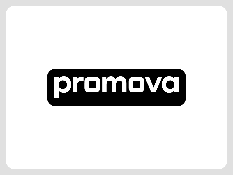
You can use the Promova wordmark logo in several variations. The first one is a wordmark itself, without any additional elements. The second one is a wordmark on a black background. Use always white letters on a black background.
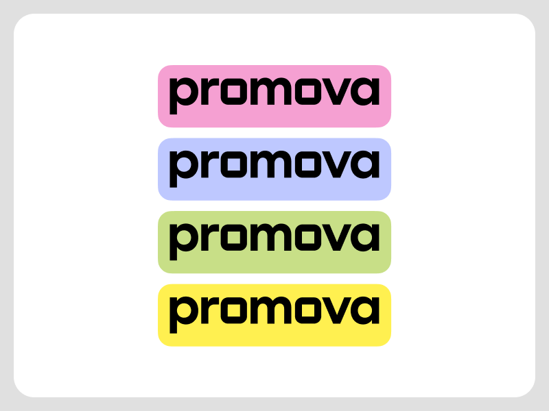
You can also use the Promova logo on colored backgrounds. Ensure to use only our brand colors. You will find them later in this article. Ensure to use only black letters on a colored background.
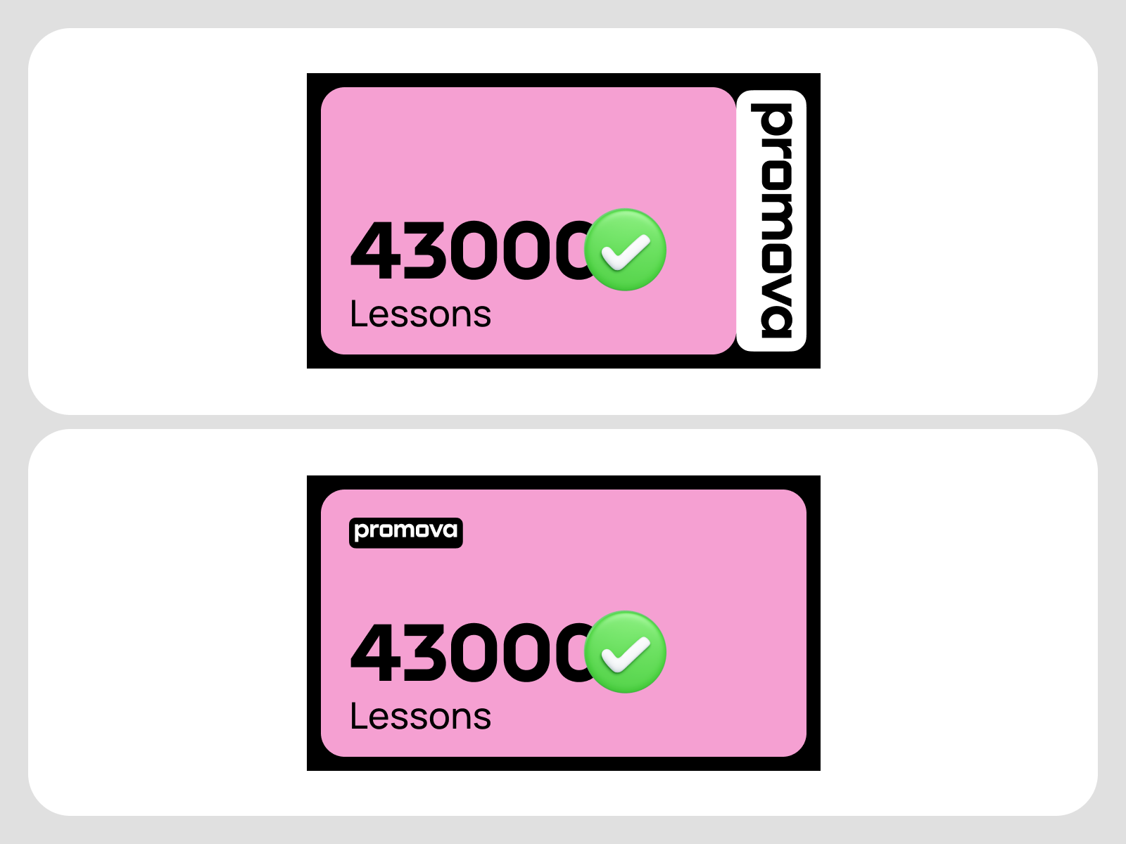
Our logo can be placed in designs in two ways. Firstly, you can affix it directly to the edges of other design elements.
If the Promova logo isn’t affixed to other design elements, let it breathe wherever you place it. Ensure that there is enough clear space, which is a distance between the logo and any other design element on the screen or in the composition.
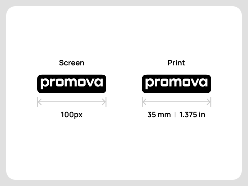
Because our logo expresses our brand identity, it should always be legible. Never use it in sizes smaller than specified.
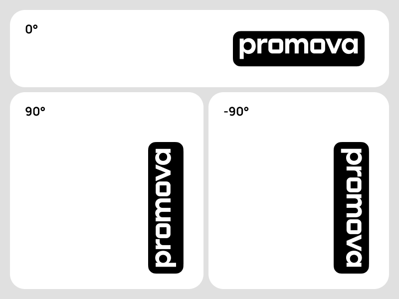
In general, we place our logo flat at a 0° angle. If any unusual formats exist, we can rotate our logo 90° to maximize the available composition space.
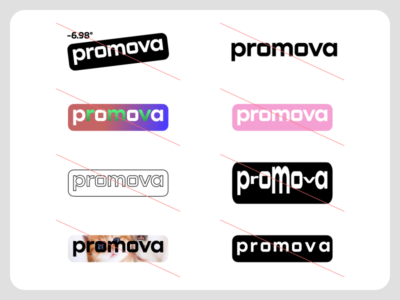
Please don’t do any of the following actions with our logo:
- Rotate to an angle other than 0° and 90°.
- Use the logo without a background.
- Use gradients.
- Use the white Promova text on a colored background.
- Stroke the logo.
- Squash the logo.
- Fill the logo with images.
- Change spacing, intervals, or proportions.
Promova Icon Logo
Our icon reflects the building blocks that are an important part of our brand identity. The icon consists of 4 blocks:
- Black for background.
- Purple (RGB: 190-200-255. HEX: BEC8FF) for the bottom block.
- Yellow (RGB: 255-240-80. HEX: FFF050) for the top right block.
- Pink (RGB: 245-160-210. HEX: F5A0D2) for the top left block.
To make the correct shapes for each block, you need to go to the “Corner Smoothing” settings and set them to 50% (in Figma). The size of the yellow top block should be 33.7% of the bottom purple block. The icon always has iOS-like rounded corners except when it’s impossible due to technical issues (e.g. square placeholder for icon avatar.)
![]()
Please don’t do any of the following actions with our icon logo:
- Create block shapes other than those specified.
- Use other colors.
- Stroke the icon.
- Use gradients.
- Change the size of any block.
- Squash the icon.
- Rotate it to any angle.
- Fill in with images.
- Combine icon and wordmark logo.
![]()
Promova Colors
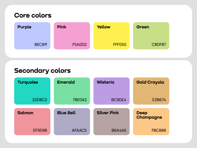
Our core colors come from our icon logo. To add vibrancy, we also use green as the fourth main color. So, the core colors of our brand are:
- Purple (RGB: 190-200-255. HEX: BEC8FF). It is considered the main one. You can use it more often than others.
- Yellow (RGB: 255-240-80. HEX: FFF050).
- Pink (RGB: 245-160-210. HEX: F5A0D2).
- Green. (RGB: 200-223-135. HEX: C8DF87).
To add splashes of delight to our UI, we all use the following secondary colors.
- Turquoise. RGB: 34-216-194. HEX: 22D8C2
- Emerald. RGB: 120-224-162. HEX: 78E0A2
- Wisteria. RGB: 188-157-228. HEX: BC9DE4
- Gold Crayola. RGB: 226-182-116. HEX: E2B674
- Salmon. RGB: 239-149-155. HEX: EF959B
- Blue Bell. RGB: 175-170-197. HEX: AFAAC5
- Silver Pink. RGB: 182-164-165. HEX: B6A4A5
- Deep Champagne. RGB: 251-200-136. HEX: FBC888
If necessary, you can lower their intensity by overlaying the white color with an opacity of 20%-30%.
Comments